
Showing all 14 resultsSorted by latest



Showing all 14 resultsSorted by latest
The postal history of the Netherlands (Nederland) reflects the nation’s journey from a traditional maritime kingdom into a pioneering hub of modern European graphic design.
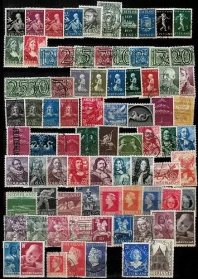
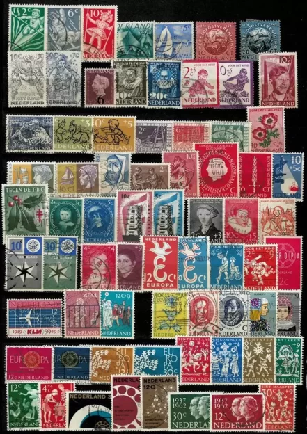
Dutch stamps are famous among philatelists for their clean typography, avant-garde artistic collaborations, and a deep reverence for their long-reigning queens.
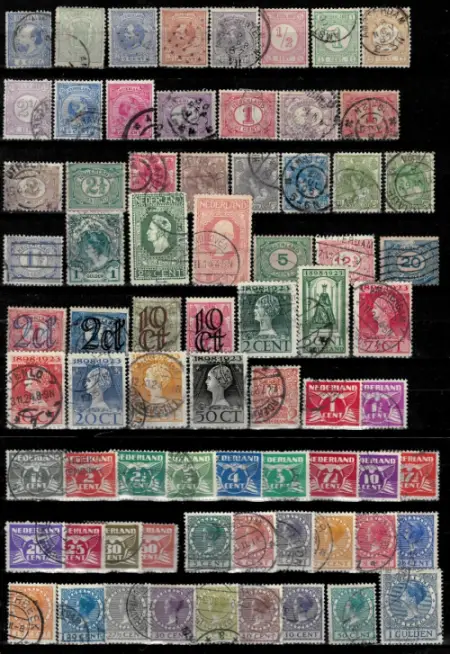
1852 5-Cent Blue (The very first Dutch stamp). Source: Europost Philately & Numismatics, THE site for collectors / Netherlands 1852 King Willem III 5 cents NVPH 1 stamped – Europost …
1924 4-Cent ‘Vliegende Duif’ (Flying Dove). Source: eBay / Netherlands 1924, Vliegende Duif, Flying Dove, 4 cent used, No …
1. The Classic Era & The Three Queens (1852–1948)
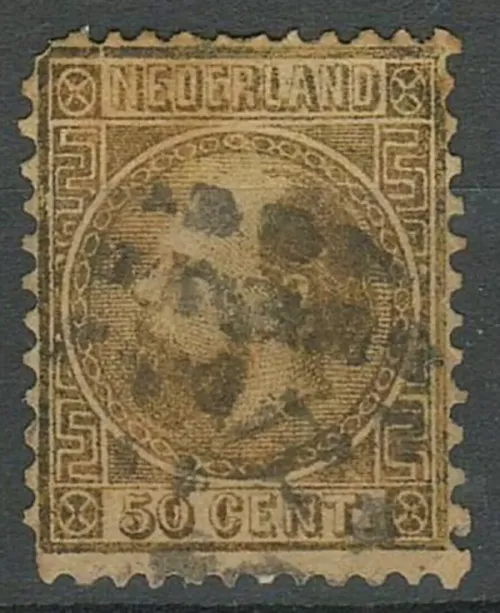
The Netherlands issued its first stamps on January 1, 1852. The inaugural set featured a right-facing profile of King Willem III inside an elegant ornamental border.
Following his death, the Dutch throne was occupied by three successive Queens whose long reigns dominated the country’s stamp portraiture for over a century:
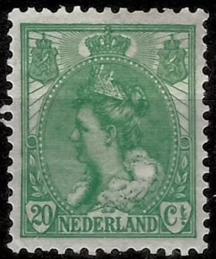
Queen Wilhelmina (1892–1948): Her stamps are highly collectible because they track her entire life literally on paper. Philatelists group her issues into famous design eras: her childhood profile with loose, long hair (Hangend Haar), her coronation portrait wearing a heavy state crown (Inhuldiging), and her elegant wartime exile profile.
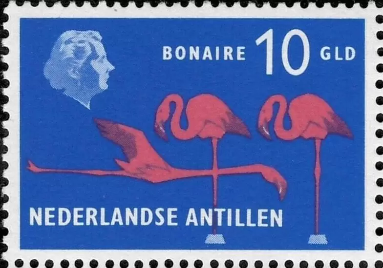
Queen Juliana (1948–1980): Juliana’s era brought clean, photographic realism to Dutch stamps. Her most iconic definitive sets replaced traditional hand-engraved sketches with high-contrast, minimalist silhouettes created from actual photographs.
Queen Beatrix (1980–2013): Beatrix revolutionized royal stamp design by approving an ultra-modern, geometric layout designed by Peter Struycken. It broke the portrait down into a crisp matrix of tiny digital dots—a reflection of the growing computer age.
2. The Modernist Graphic Revolution
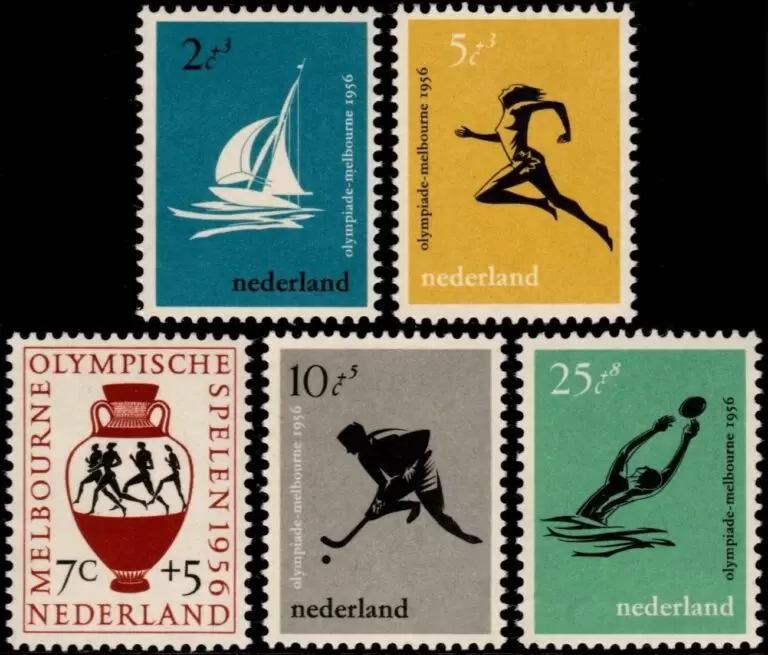
While other countries favored conservative, classical designs, the Dutch postal service (PTT) actively leaned into avant-garde art movements. Starting in the 1920s, the PTT hired famous industrial designers, architects, and typographers to design their issues.
The Flying Dove (1924): Designed by Art Nouveau artist Chris Lebeau, the Vliegende Duif series (pictured above) used bold, fluid lines and stylized geometry to merge the value numeral directly into the wings of a dove.
The Child Welfare Stamps (Kinderpostzegels): Launched annually since 1924, these world-famous semi-postal stamps carry a small surcharge to fund children’s charities. The PTT gave designers complete creative freedom, resulting in striking, colorful experiments with abstract art, child photography, and constructivist typography.